When in doubt, zoom out!
The recent 37% correction from Solana's high of $126 to $79 has been making us wonder, are we now in a bull market or not? While Bitcoin has already recovered to new highs and Solana is on a good path to get there, the uncertainty in the market is still not cleared.

Mango
Share post
Practicing regular sanity checks is a healthy approach to maintain clarity of the current market direction. One such sanity check is the Rainbow Chart.
Understanding the Rainbow Chart
The Rainbow Chart is a tool that maps out Bitcoin's price against a multi-colored logarithmic scale. Each color band represents a market sentiment, ranging from 'Buy' in the blue zones to 'Sell' in the red zones. The chart offers a visual aid to conceptualize where the market might currently stand and where it could be headed, based on historical price action.
The importance of perspective
When faced with sharp price movements like those recently seen with Solana (and Bitcoin), a zoomed-out perspective becomes invaluable. Short-term fluctuations often evoke emotional trading decisions, which can lead to suboptimal outcomes. By adopting a wider viewpoint, akin to looking at Bitcoin's long-term trends, investors can gain a clearer understanding of underlying market cycles.
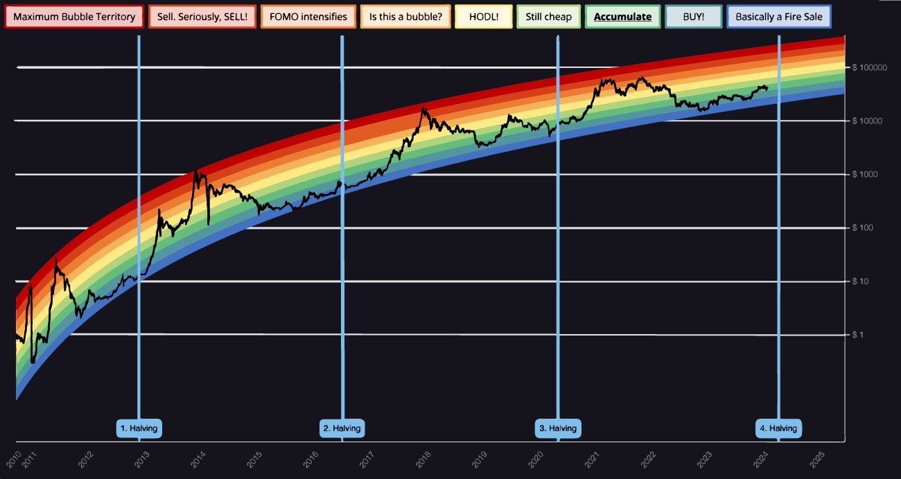
Reading the rainbow – bull vs. bear
The Rainbow Chart helps to demystify market phases. For Bitcoin, and by extension altcoins like Solana, the middle zones—ranging from 'Maximum Bubble Territory' to 'Basically A Fire Sale'—can indicate a transitional market, while the extremes suggest overheated or undervalued conditions. Recognizing these zones allows traders to assess whether the market is currently bullish or bearish.
How to 'zoom out'
To effectively 'zoom out', traders should:
- Analyze long-term price charts, noting historical support and resistance levels.
- Consider the implications of market cycles and how they relate to current price levels.
- Compare Bitcoin’s behavior to altcoins like Solana to understand market correlation.

Limitations and considerations
While the Rainbow Chart is a useful visual guide, it's not infallible. It simplifies complex market dynamics and should be used alongside other analytical tools. Indicators such as on-chain data, trading volume of the market as a whole, and economic indicators provide a more nuanced view of the market.
In summary
The recent volatility seen in Solana's price underscores the need for a broad perspective when evaluating market stages. While no single tool can provide all the answers, the Bitcoin Rainbow Chart offers a colorful way to conceptualize market phases.